
Before we get down to colour choices and colour psychology for retail stores, let’s get one thing clear. If you’re a retail owner who believes that brick-and-mortar retail stores are becoming obsolete, think again. In fact, think hard again. You can improve the look of your retail store by talking with commercial painting services.
Even if consumers order most things through the internet because it’s a convenient trend, and makes people lazier to leave the house, retail stores will remain a destination in themselves. There are certain in-store experiences in terms of personal assistance that websites cannot give. There is merchandise that needs to be seen, touched, even smelled, and interacted with, before a purchase is made.
Need more convincing? In the U.S. alone, 73% of purchases and decisions to purchase are still made in retail stores.
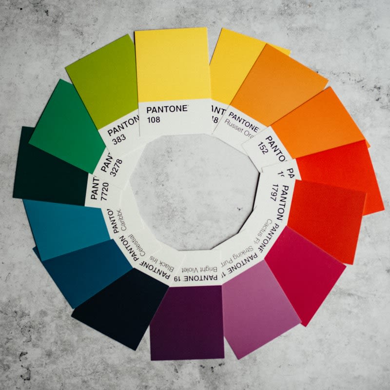
The psychology behind retail store colours
As retail owners, you need to know that potential customers make a subconscious judgement within 90 seconds of entering a store. This has everything to do with the interior colours in the store.
- 62% to 90% of first impressions of stores are based on colour.
- 52% of customers won’t return to a store if they don’t like the interior design.
- 93% of buying decisions are based on visual appearance.
- Colour advertisements outside the home are read 42% more than internet ads.
- Colour increases brand recognition by around 80%.
- Colour boosts memory by adding an extra stimulus for the brain.
Retail store colours can target a specific market through emotion
- Younger customers are drawn more to bright and bold colours. Older shoppers prefer subtle colours.
- For impulse buying, use black, royal blue, and red-orange. To target budget shoppers, use navy blue or teal.
- For targeted female shoppers, use blue, purple, and green; for the males, use blue, green, and black colours.
If you want your store to immediately grab attention, use shades of red. This colour prompts attention, quick decision, and increases heart rate. It has this “look at me” effect and reduces analytical thinking. If you own fast-food dining or a confectionery, red also increases appetite.
Pink evokes calmness, romance, light-heartedness, and happiness. It is also a soothing colour. Naturally, pink is the de facto colour for females. It is used for retail stores that market feminine products and gifts for women.
Orange goes well for stores with fitness products (or for fitness gyms), clothing, and supplements.
Blue works well for stores that deal with financials and for pet stores.
Black evokes strength, authority, and classiness. It’s a good colour for electronics retail stores and men’s clothing.
A&A Painting Ltd.
If you own a retail store or any business in the West Kootenay areas, particularly in Nelson, Castlegar, and Trail, you might need fresh coats of paint for it. You don’t need to go far because you can call the most experienced and dependable professional painting contractor in the area, A&A Painting. We have over 30 years of experience in commercial painting services, and our past and present clients can attest to this. We are bonded, licensed, insured, and all personnel are fully background checked.